NOTEN KAAS
RESTAURANT BRANDING
Client
NOTEN KAAS
Industry
Restaurant
Services
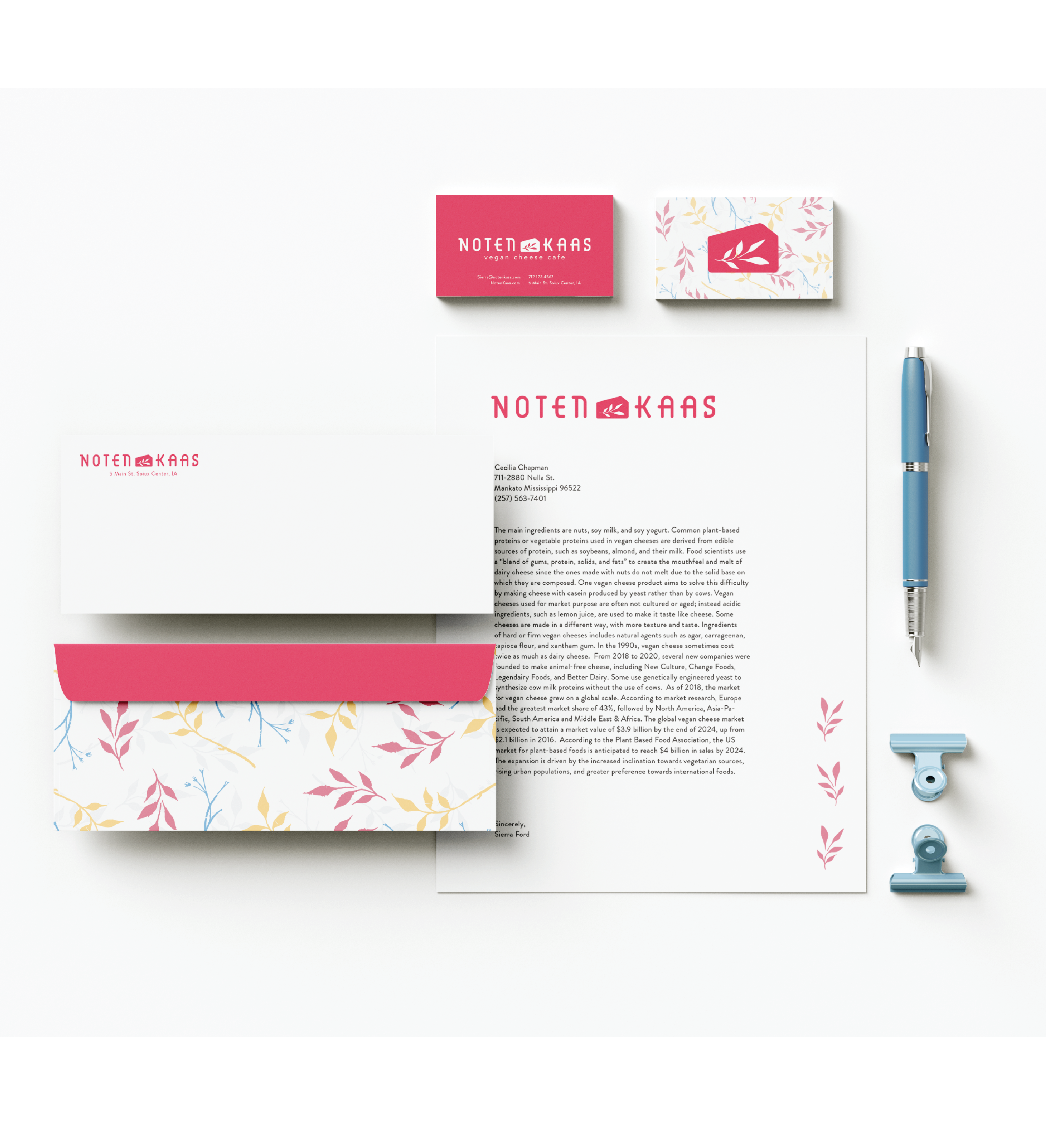
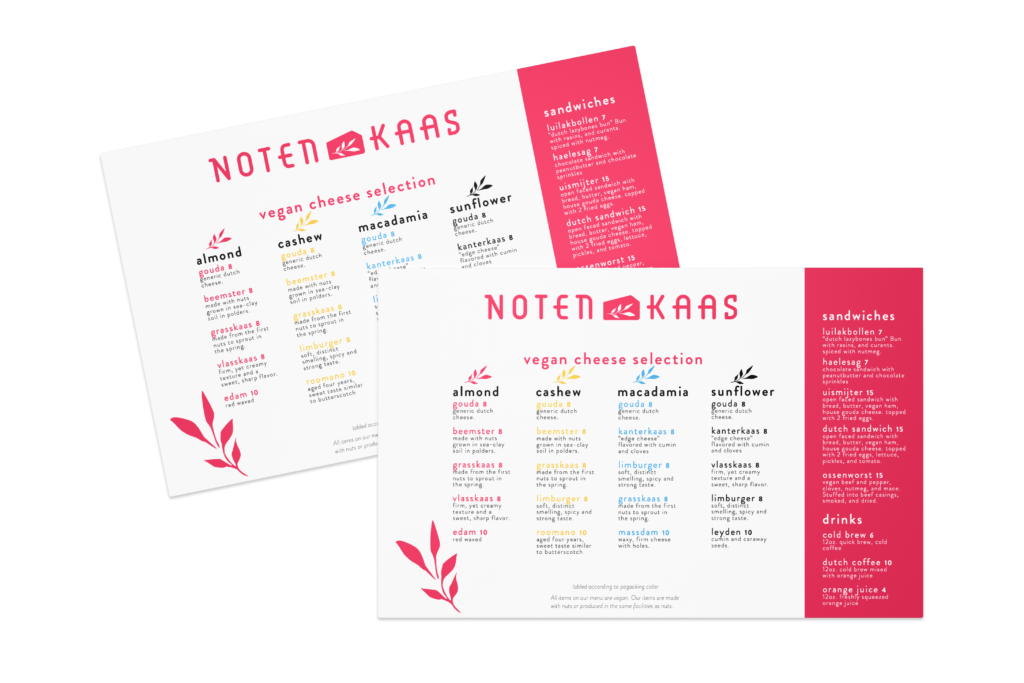
Logo System, Packaging, Menu, Merchandise, Stationery
Noten Kaas is the Dutch translation of cheese made from nuts. With the style of a Dutch cheese cafe with a fully vegan aspect, the graphic in the title represents a wedge of cheese with a set of leaves.BD Viewmaster was the font used for the logo. This was chosen to reflect the mono space style found in Swiss type, a movement used frequently by Dutch designers. The subtitle is set in Avenir Book, a simple sans serif set with wide letter spacing.
BRANDING
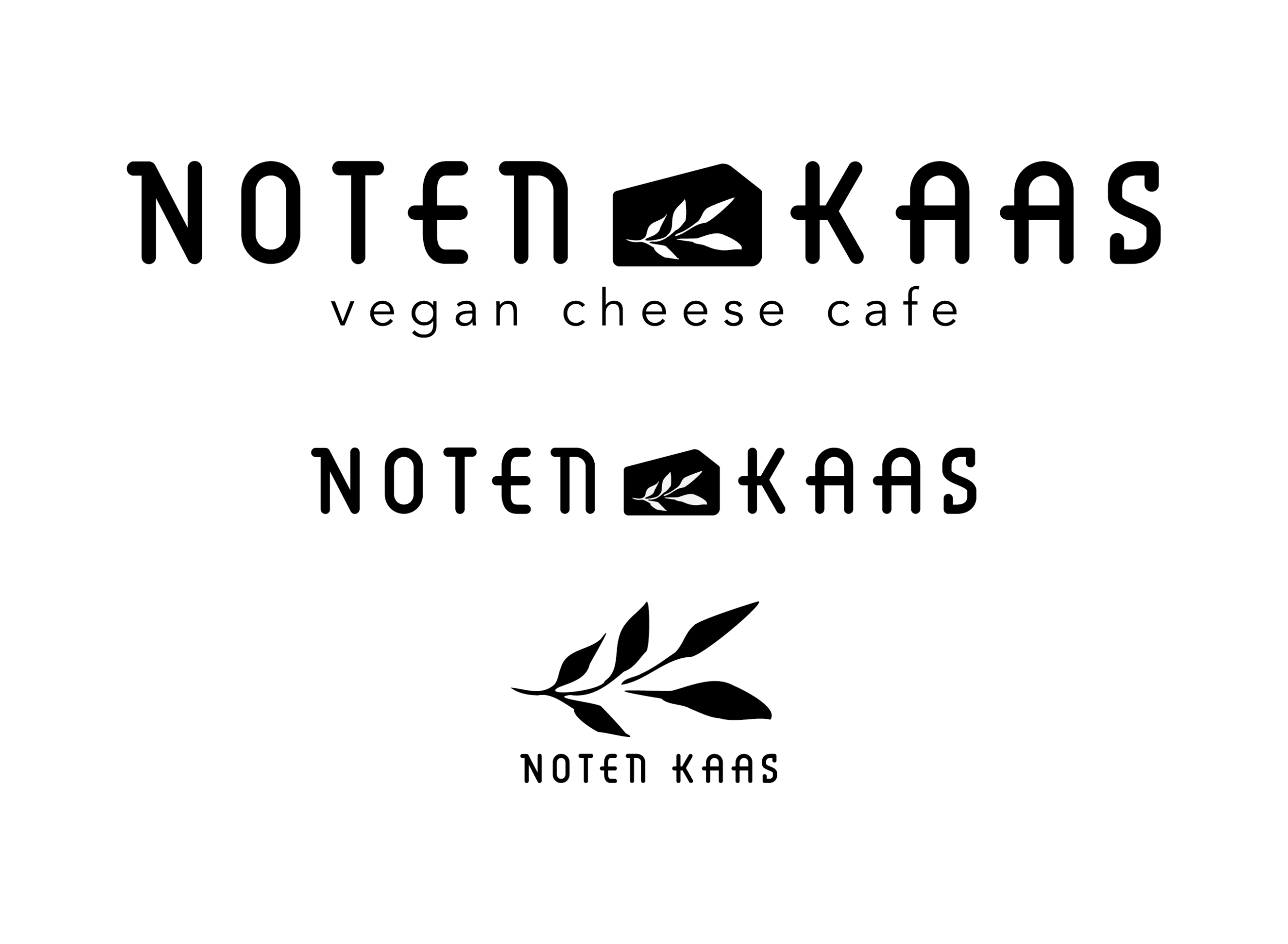
Size Variations
The designs of these logos are differentiated to fit different spaces.The graphic between “Noten” and “Kaas” is a block of cheese with a set of leaves. The first design is made as a first point of entry. This is for signage and other assets that may introduce someone to the company.The second design is used on assets that involve other text. The third design is made for more square spaces.
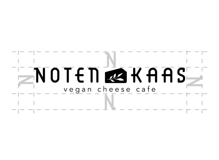
Clear Space
When using this logo it is important to leave space around to not confuse the identity of the company. To be sure that this space is proportional throughout all sizes, the “N” which comes directly from the logo is the space that should be left around.
Color Variations
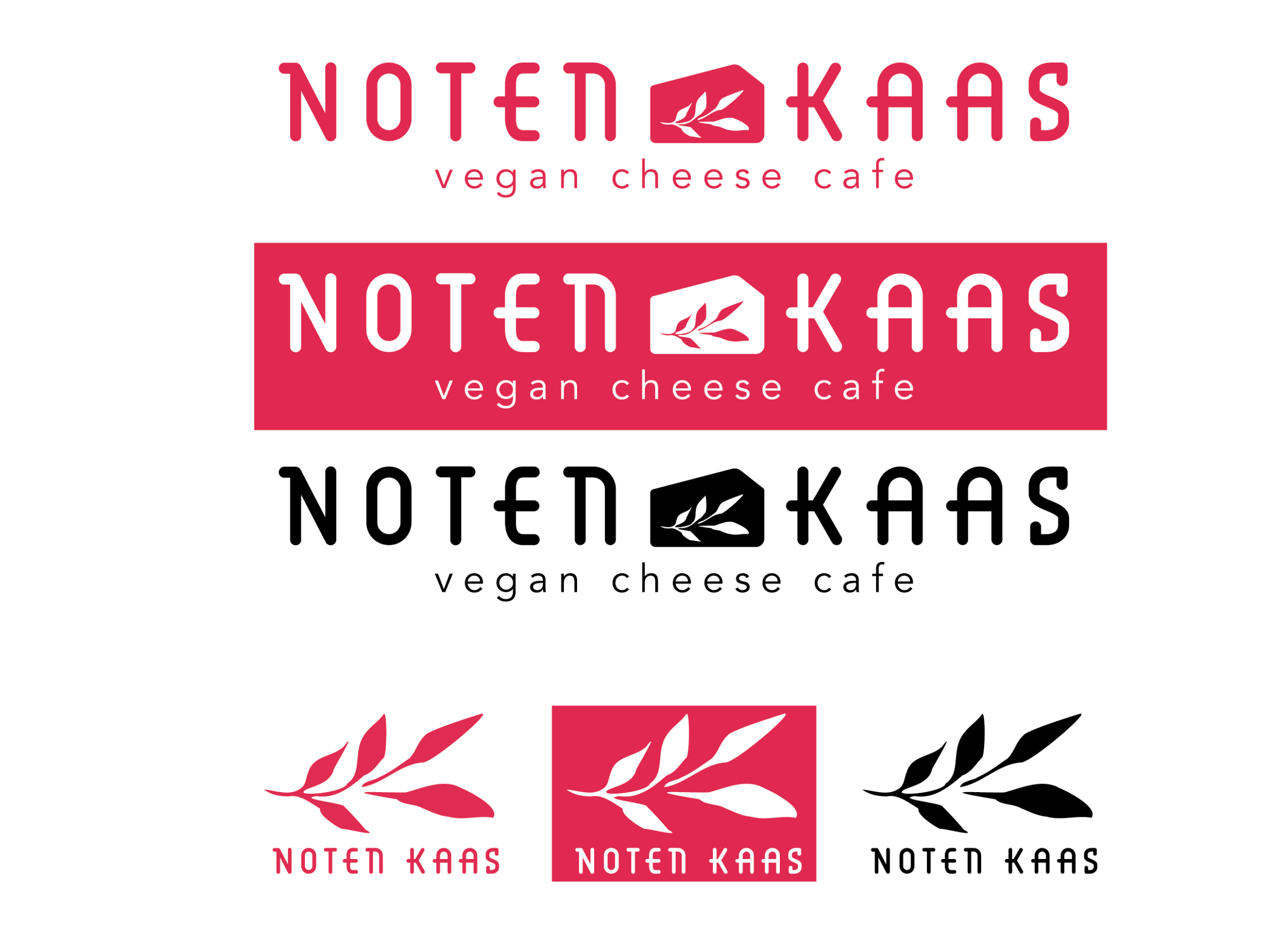
Depending on the context, the logo will be used in either red, black, or white on red. These distinctions are based on the context of the logo. While working with a poster, white on red is ideal; all advertisement and some product design has a red background and white text.The black logo is available for b&w printing, as a replacement for the red logo that should be used if color printing is available.
Font Palette
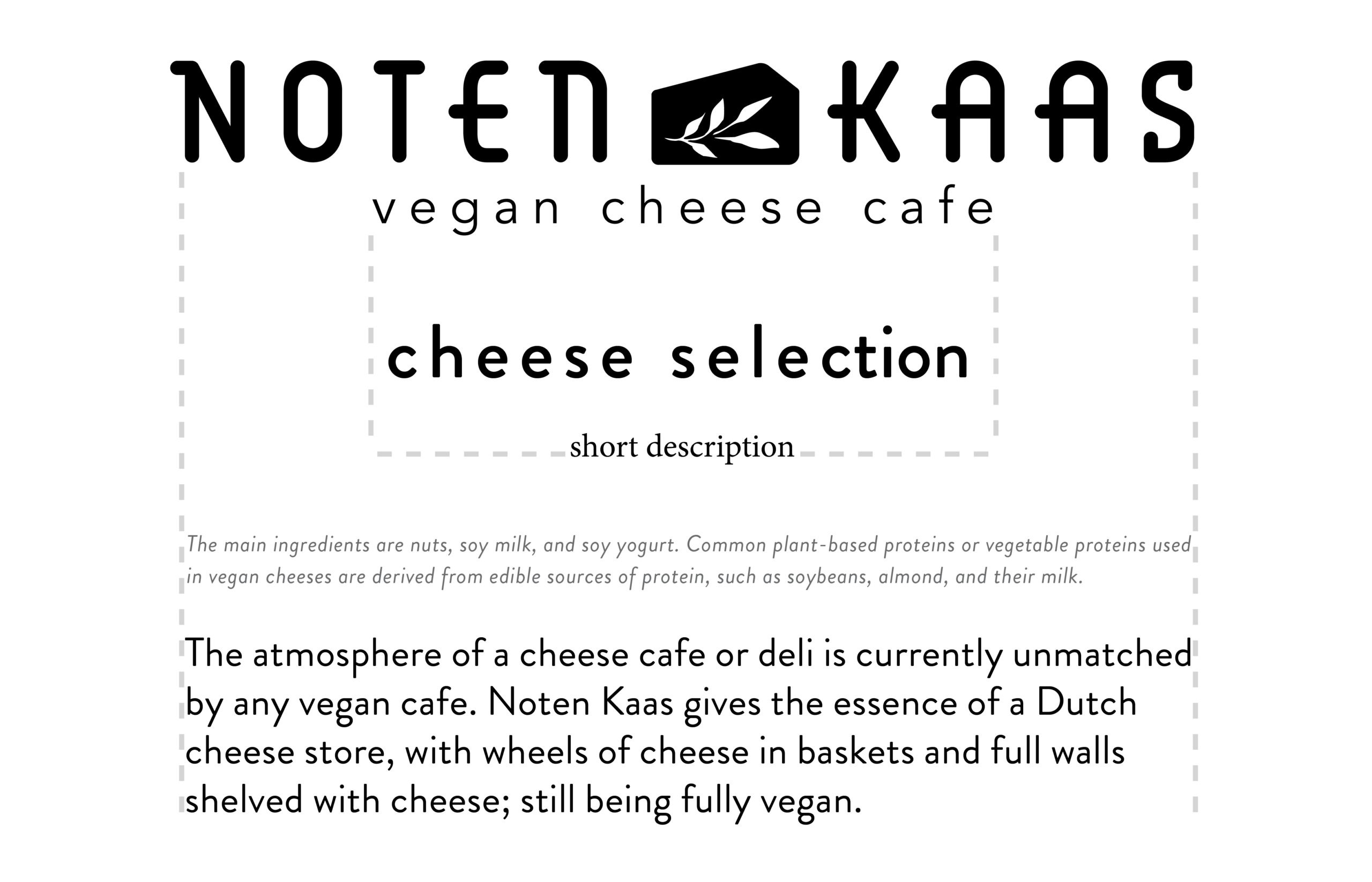
The fonts used are BD Viewmaster (logo) Avenir Book (logo sub-head) and Brandon Grotesque for all other purposes.BD Viewmaster was chosen to pay visual homage to the Bauhaus movement that originated in Germany at the Bauhaus School that taught typography. BD Viewmaster is a geometric font with qualities of Swiss typography.While writing headers and subheads, it is important to keep all text lowercase. This is found throughout the brand and is important to keep consistent.
Color Palette
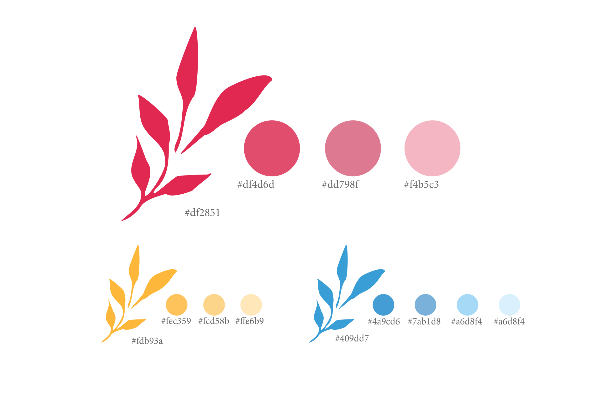
The colors found in this system are red, blue, and yellow. While the core color is red, the blue and yellow are offered as supports for stylistic accents. This combination of colors is reminiscent of the colors found in De Stijl, a Dutch art style translated to “The Style”. Paying homage to Dutch art is important to this brand as the restaurant is not located in the Netherlands, but trying to replicate the feeling as if it was.
MARKETING COLLATERAL
Merchandise
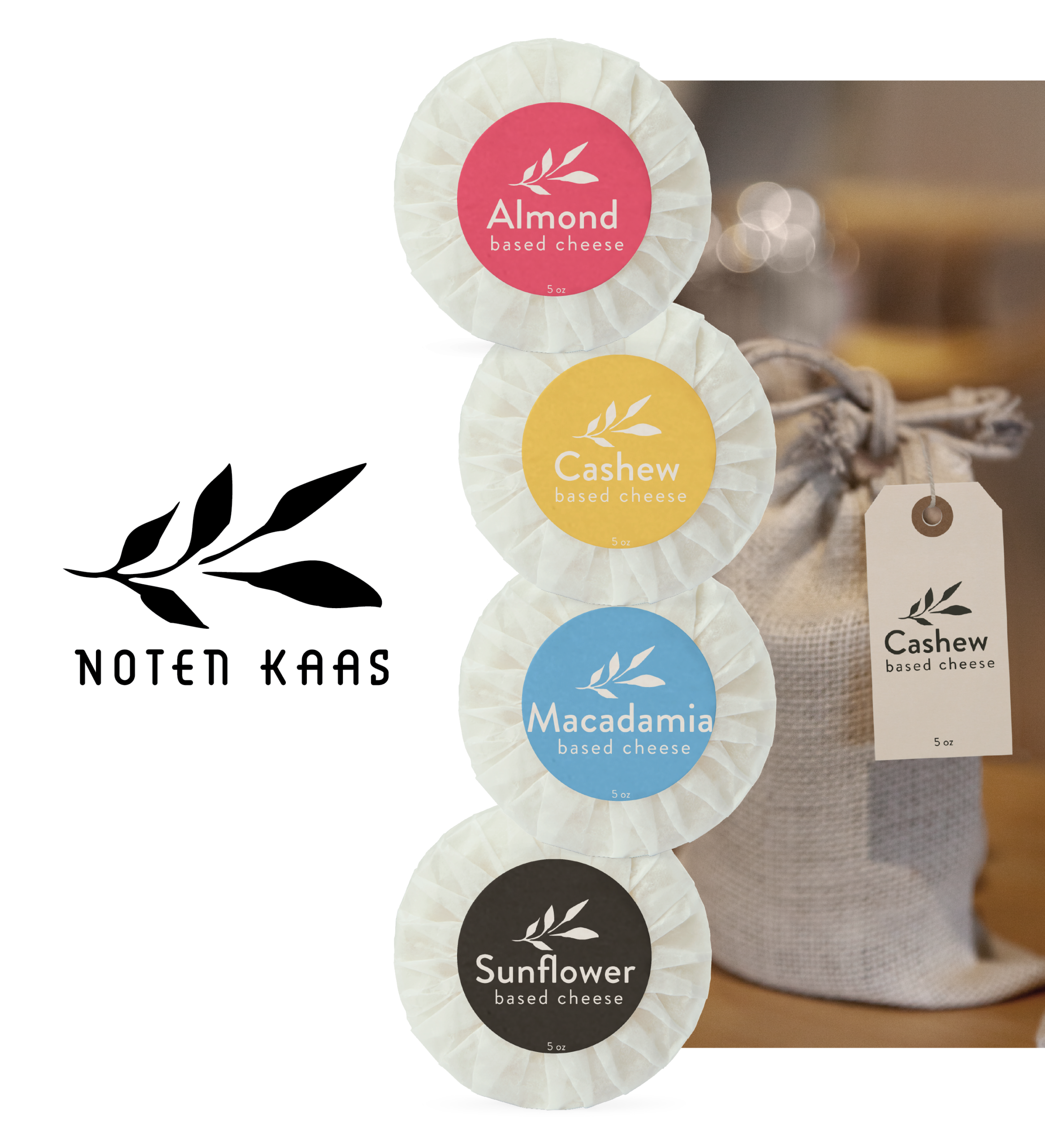
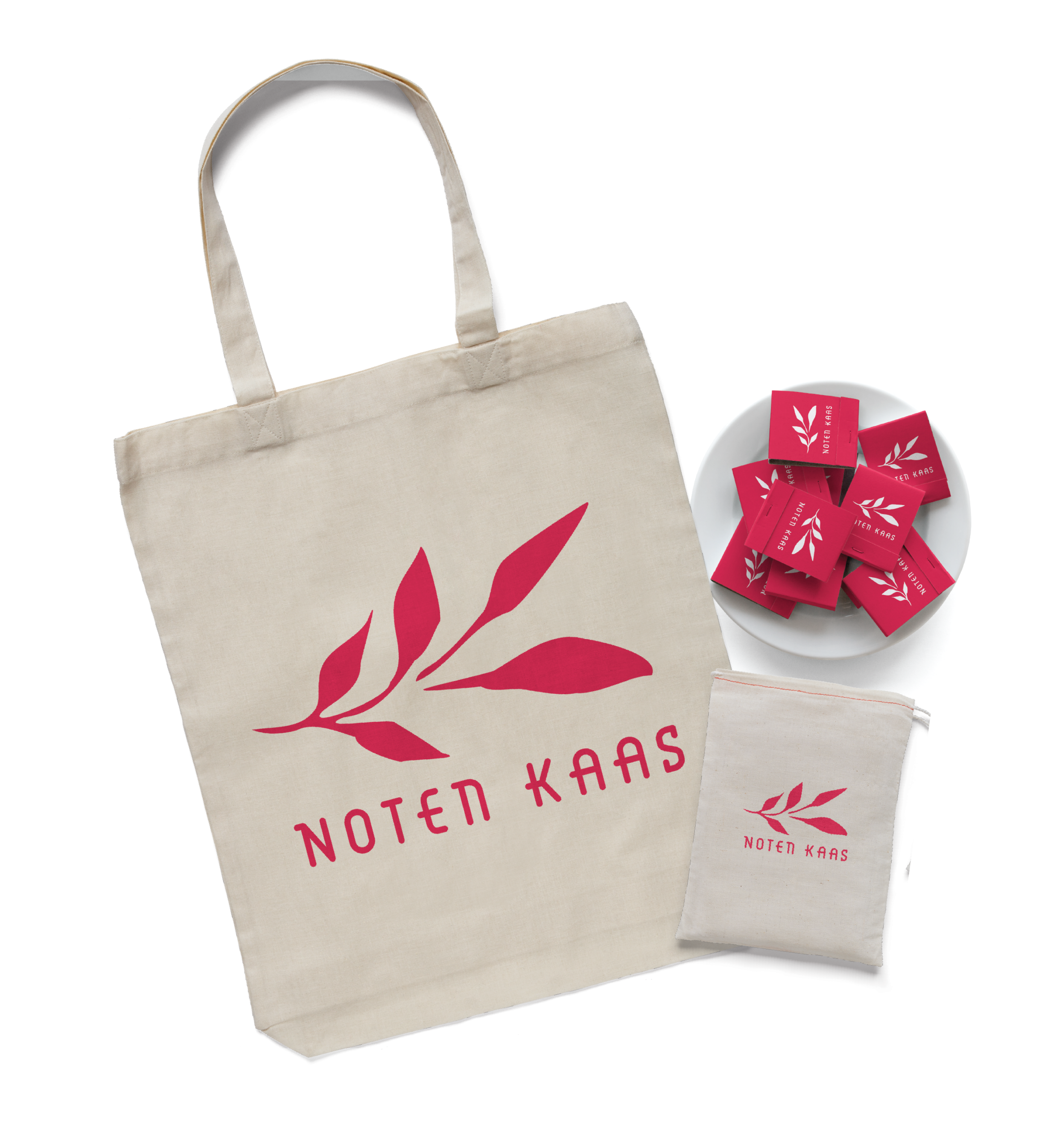
Packaging